
Find My Class

I am excited to present the first project I ever worked on. For this project, my class was tasked with identifying a problem that students at DePaul University face and designing a solution. My group decided to address the challenge of navigating campus buildings, as DePaul has two campuses with complex layouts, including entrances and elevators that don’t always connect to every floor. This often makes it difficult for both new and returning students to find their classrooms.
Role
Lead UX/UI Designer UX Researcher
Time
September 2022- November 2023
Tools
Figma
“Skill is only developed by
hours and hours of work.”
— Lewis Hamilton
What’s The Problem?
How might we improve students' ability to navigate DePaul’s campus buildings to alleviate stress and create a frictionless commute to class?
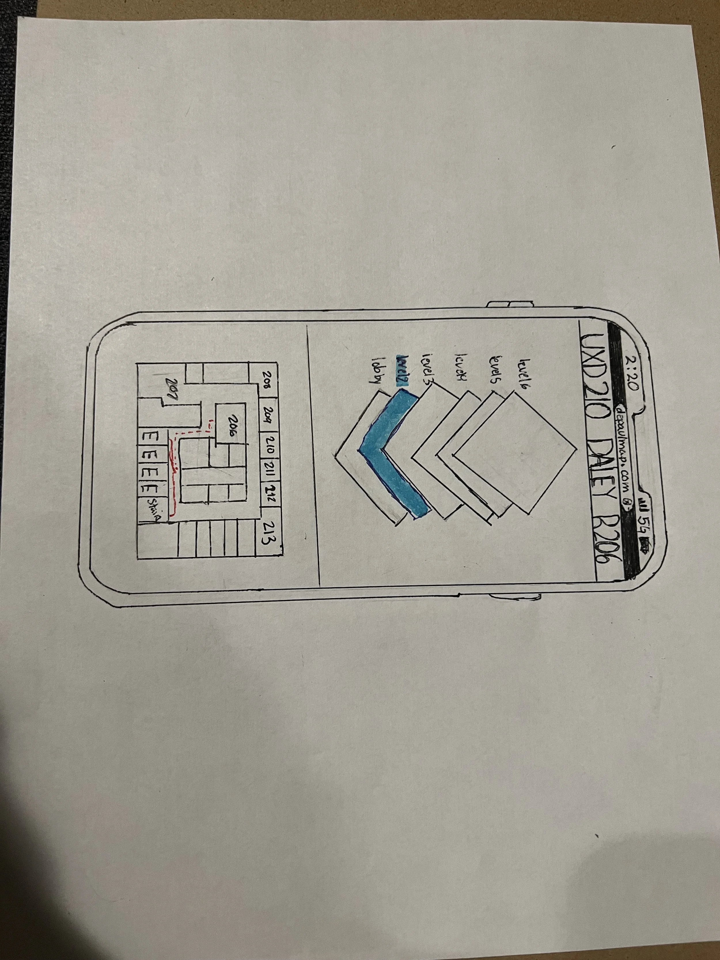
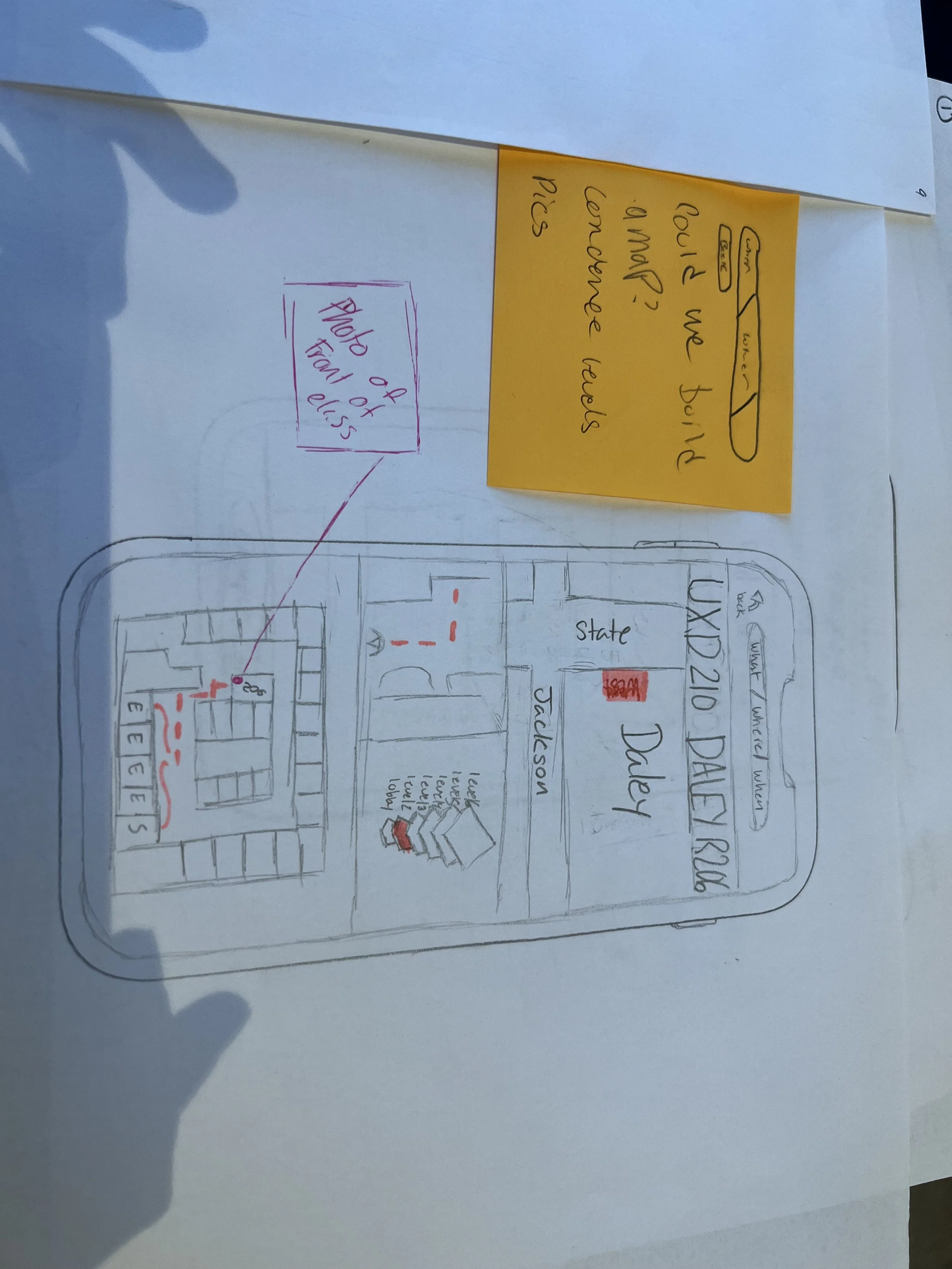
The Solution
A GPS-based navigation tool designed specifically for DePaul’s campuses, guiding students directly to their classrooms. Check out the prototype, or keep going for more information!
Research
Results
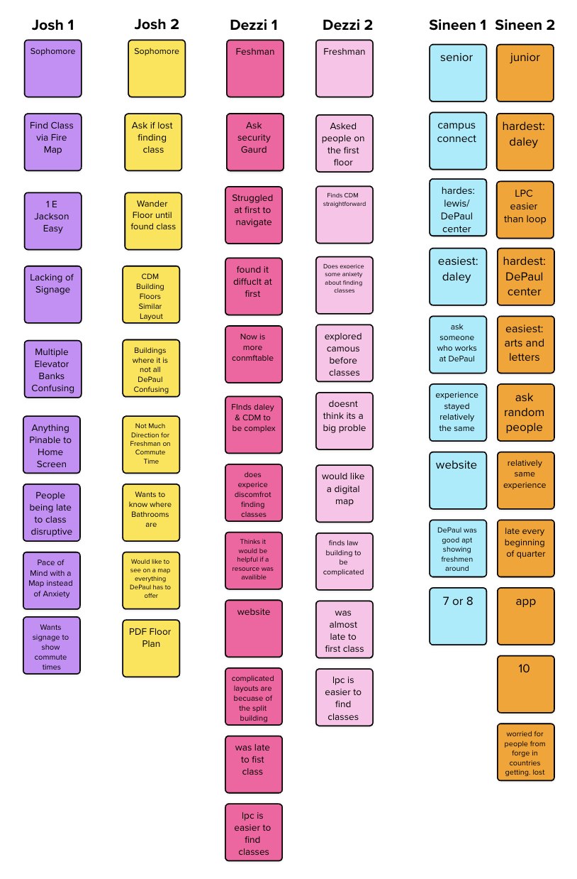
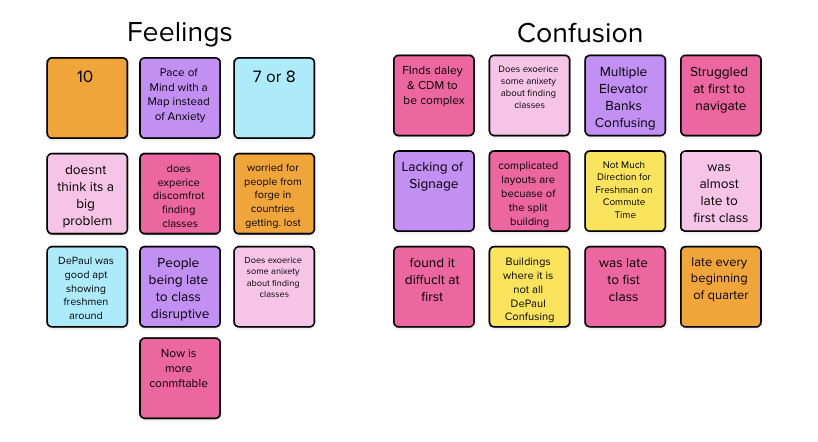
From our interviews we realized that the major problems were:
Much more confusing to navigate as a new student
Finding classes leads to stress and anxiety
Dependency on others at the beginning of each quarter
Each group member interviewed DePaul students to:
Validate whether this issue was a widespread concern.
Understand how students currently navigate campus and assess potential solutions.
Identify desired features for a navigation tool.

Ideation
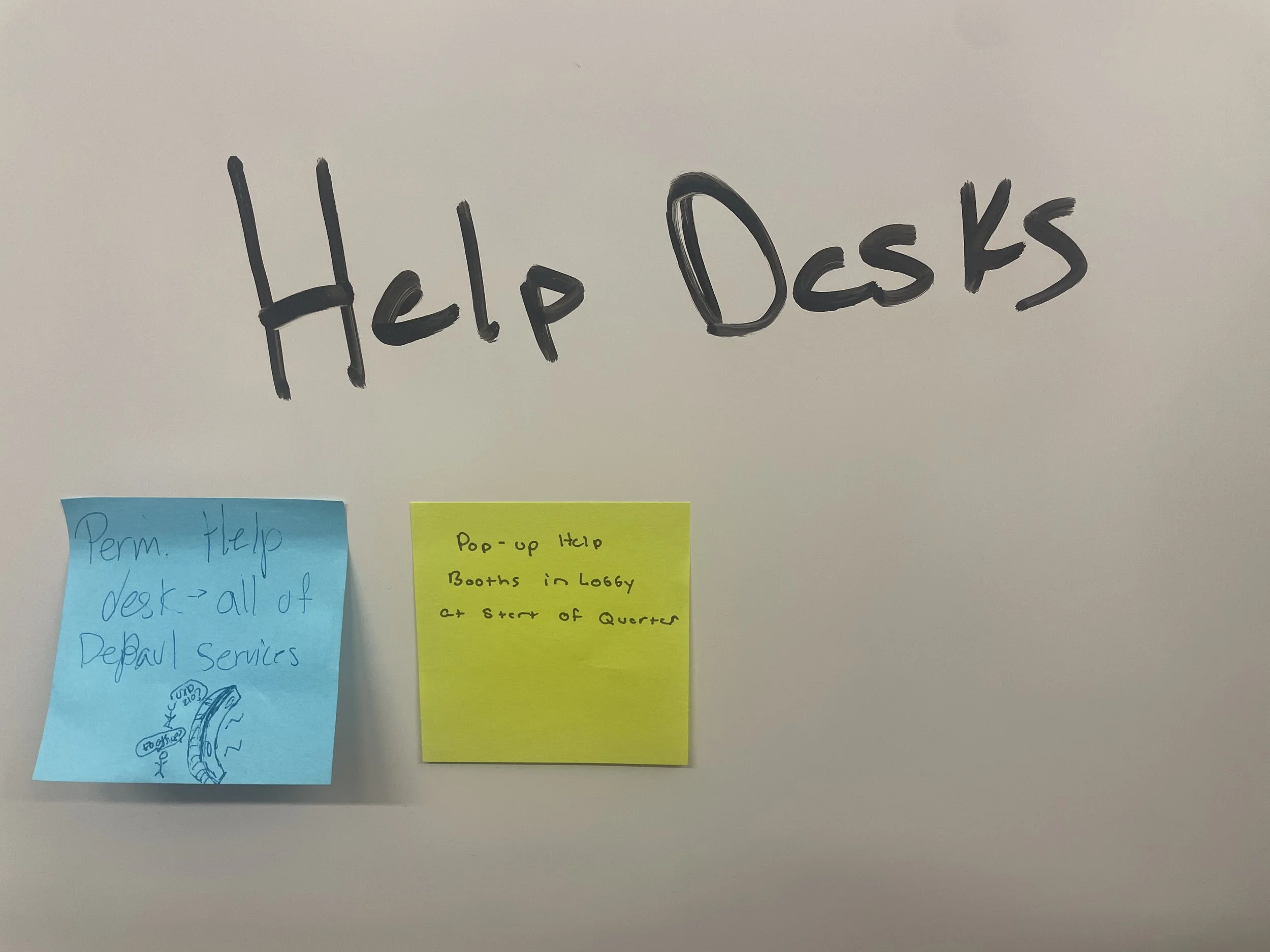
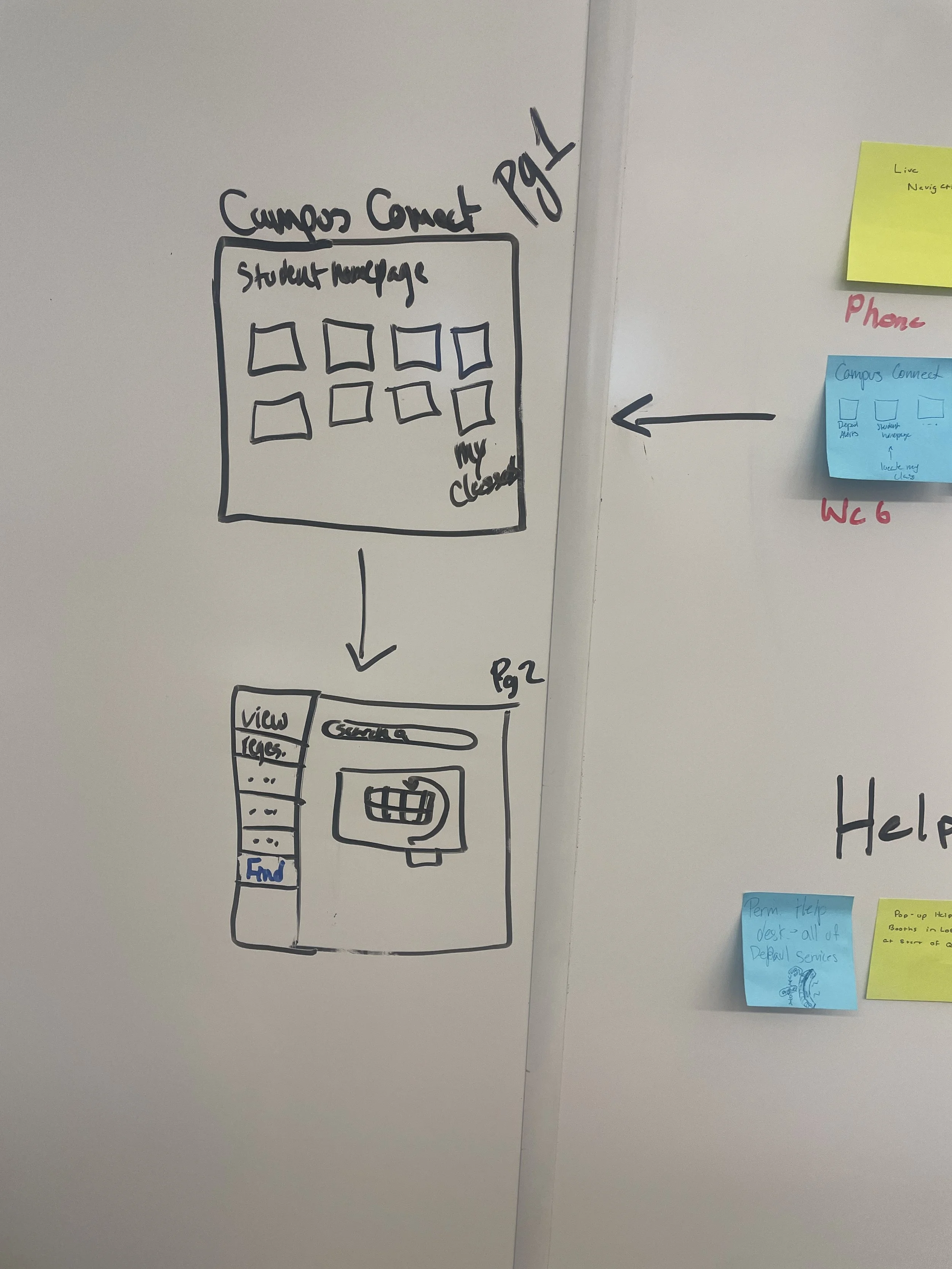
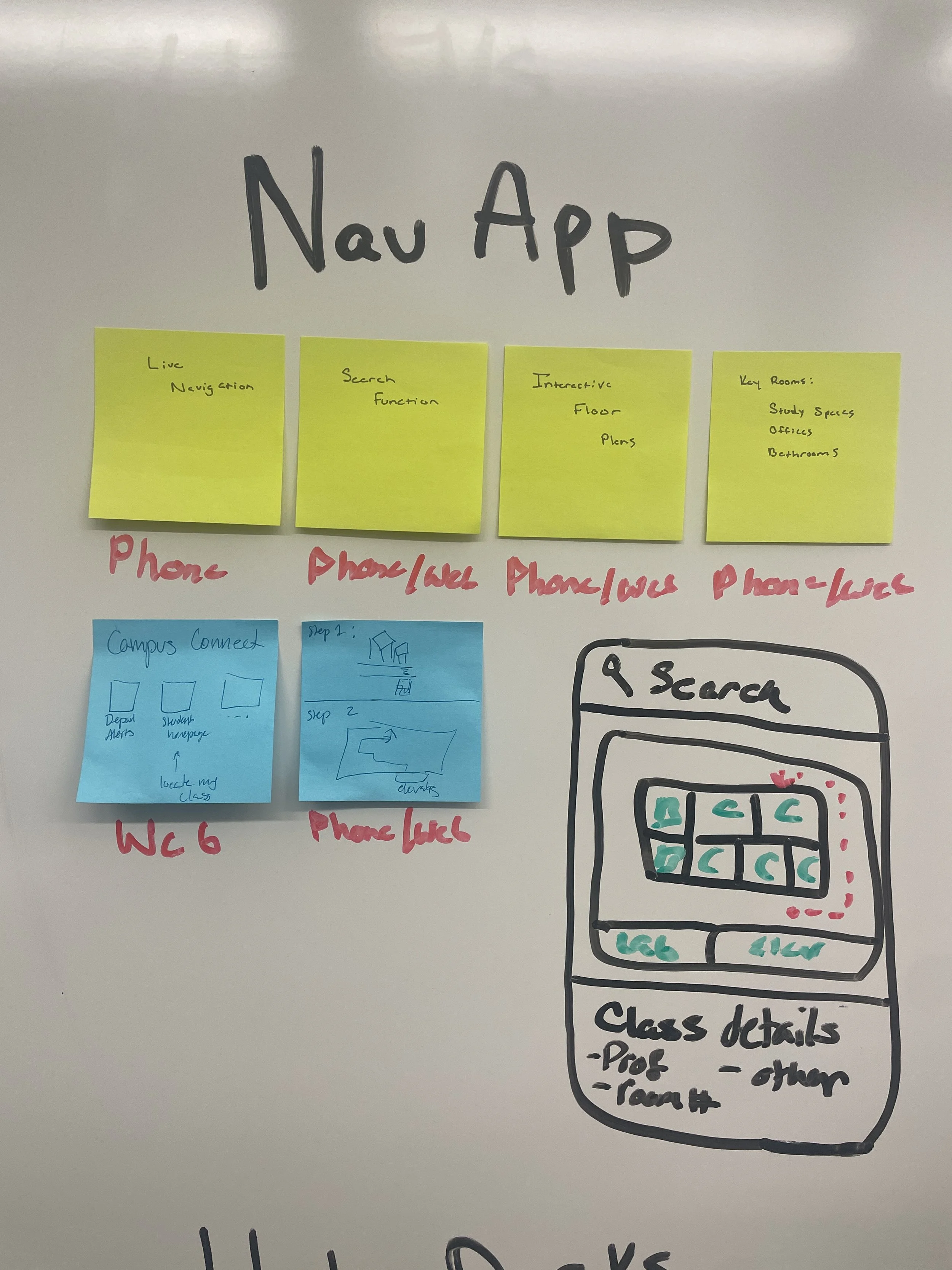
After understanding the scope of the problem students face, we brainstormed possible solutions like a help desk or a monitor in the lobby, but in the end, we decided having access to support on the phone would be the most beneficial.
Brainstorming
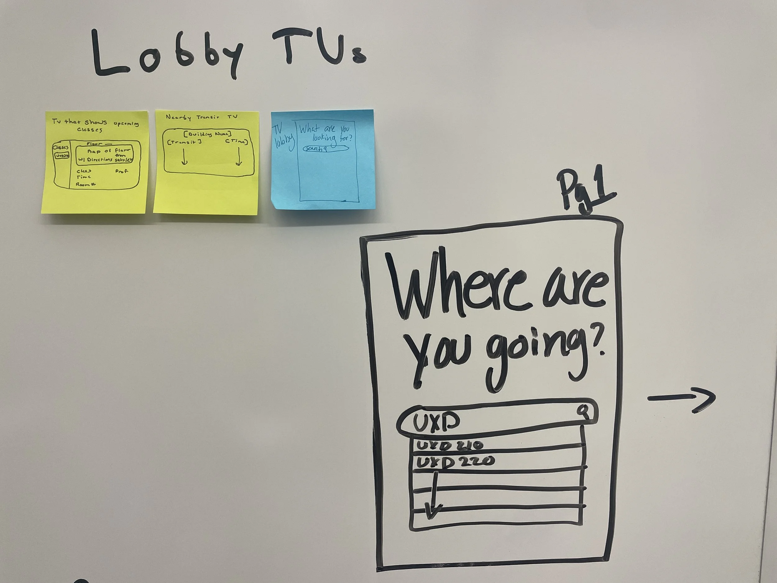

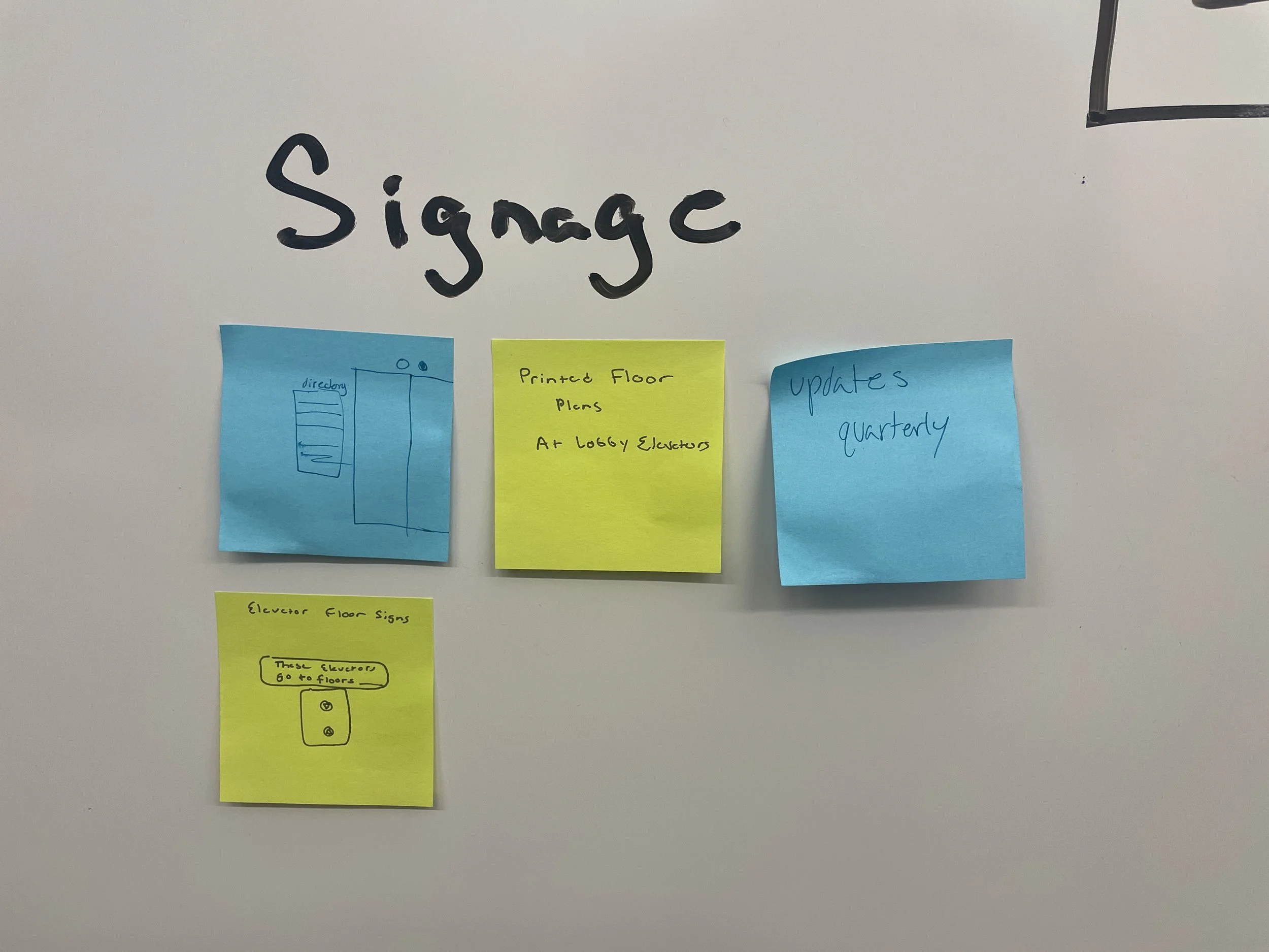

Story Boards
User Flow

User Testing
Using the scenarios below, we asked DePaul students to test our prototype.
The students were asked to think out loud as much as possible and complete the tasks given. They were also encouraged to ask questions, though we were mostly unable to answer until after the test was complete.
We did not provide help anytime users got stuck, as we were partly testing for how intuitive the design was.
-
Scenario One
It is the first day of the quarter and you are trying to make it to your class, but you do not know where to go & you are stressed for time. It does not look like anyone around you seems to know either as they all crowd around the security desk to ask for directions. You pull out your phone and sign in to campus connect to use the map provided. Please go through the process of locating your class, UXD 210. You are currently in the DePaul Center.
-
Scenario Two
Your club is meeting in LPC, but you are a Loop student and have not figured your way around this campus yet. You are not very good at following directions when people tell you where to go so you prefer to have a map in front of you. You sign into Campus Connect and use the campus navigation provided for you. Manually input the information to find room 241 of the Levan Building- 2nd floor.
-
Scenario Three
You are a person who likes to prepare everything and know exactly what you are doing in advance and plan. The night before the beginning of a new quarter, you are checking to see where the Arts and Letters Hall is on a map. Please find out the location of Arts and Letters.
Problems & Fixes
-
The welcome message that explained what Find My Class is and how to use it was too long and we found the users either quickly skimming it or ignoring it outright. So, we shourtended the mess and broke it up more, makeing it less daunting.
-
The “Skip” button, meant to indicate that a user can search for classes without putting in all their information, ended up being misunderstood or missed entirely “Skip” was changed to “See on Map” and made larger to be more donvinent for the user.
-
The current location page was built out unintuitively and inconsistently with the rest of that platform. this created slight confusion with the users throughout testing. It was redesigned with this in mind.
-
Users repeatedly mentioned their preference for a labeled map. Some also brought up using icons or more clear language to label stairways and elevators.
-
The progress bar at the top of the page made to work in accordance with the Visibility of System Status Heuristic. Some useres thought the progress bar was suppposed to be used to toggle back and forth between the steps. So we, we made it into a toggle.